library(ggplot2)
ggplot(iris, aes(x = Species, y = Sepal.Length)) +
  geom_col()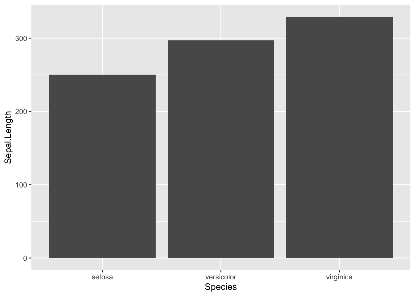
ggplot()을 이용해 그래프를 그리면 일반적으로 다음과 같이 출력됩니다.
library(ggplot2)
ggplot(iris, aes(x = Species, y = Sepal.Length)) +
geom_col()
x축의 tick이 막대그래프의 중앙에 위치해있습니다. tick이 막대의 가운데가 아니라, 막대 양 옆에 위치하여 막대 아래에는 Species의 이름만 나타나게 하려면 다음과 같이 실행할 수 있습니다.
library(data.table)
iris_dt <- as.data.table(iris)
iris_dt$Species2 <- as.integer(as.factor(iris_dt$Species))
iris_dt
x_ticks <- c(0, unique(iris_dt$Species2))+0.5
x_ticks[1] 0.5 1.5 2.5 3.5len <- length(x_ticks)
ggplot(iris_dt, aes(x = Species2, y = Sepal.Length)) +
geom_col() +
scale_x_continuous(
breaks= c(unique(iris_dt$Species2),x_ticks),
labels = c(unique(as.character(iris_dt$Species)), rep("",len))
) +
theme(
axis.ticks.x = element_line(color=c(rep(NA,len-1), rep('black',len)))
)
원래 그래프를 보면 y축의 0과 x축이 떨어져 있는 것을 알 수 있습니다.
ggplot(iris, aes(x = Species, y = Sepal.Length)) +
  geom_col()
이제 y축의 범위를 아래와 같이 지정해주겠습니다.
ggplot(iris, aes(x = Species, y = Sepal.Length)) +
  geom_col() +
  scale_y_continuous(expand=c(0,0))
이처럼 expand를 통해 막대그래프가 x축에 붙어있을 수 있도록 출력할 수 있습니다.