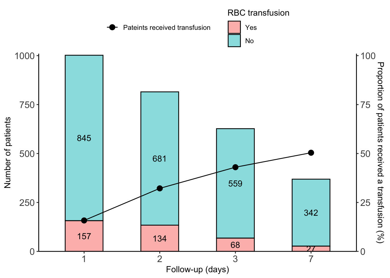
dat <- data.table(
  day= as.factor(rep(c(1,2,3,7),each=2)),
  transfusion=rep(c('Yes','No'), 4),
  num=c(157,845,134,681,68,559, 27,342)
)
dat[,transfusion:=factor(transfusion, levels=c('No','Yes'))]
dat[,y_pos := cumsum(num)-0.5*num,by=.(day)]

dat[,prop :=num/sum(num)*100,by=day]
dat
ratio <- data.table(
  day= as.factor(c(1,2,3,7)),
  prob = c(15.8,32.2,43.0,50.4)
)
ratio
ggplot()+
  geom_col(data=dat,aes(x=day,y=num, fill=transfusion),
           color='black', alpha=.5,
           width=0.5,
    position = position_stack()) +
  scale_y_continuous(limits=c(0,1010),expand=c(0,0),
                     name='Number of patients',
                     sec.axis = sec_axis(~.*0.1,
                                         name='Proportion of patients received a transfusion (%)'))+
  geom_point(data=ratio, aes(x=day, y=prob/0.1,
                             color='Pateints received transfusion'),
             size=3)+
  geom_text(data=dat, aes(x=day, label=num, y=y_pos))+
  geom_line(data=ratio, aes(x=day, y=prob/0.1, group=1,
                            color='Pateints received transfusion'))+
  theme_classic() +
  scale_color_manual(values=c('Pateints received transfusion'='black'))+
  scale_fill_discrete(direction=-1,
                      breaks=c('Yes','No'))+
  labs(x='Follow-up (days)',
       fill='RBC transfusion',
       color='')+
  theme(legend.position='top',
        legend.direction = 'vertical',
        legend.box = 'horizontal',
        legend.box.spacing = unit(1,units = 'mm'),
        axis.text.x = element_text(size=12),
        axis.text.y = element_text(size=12)
        )